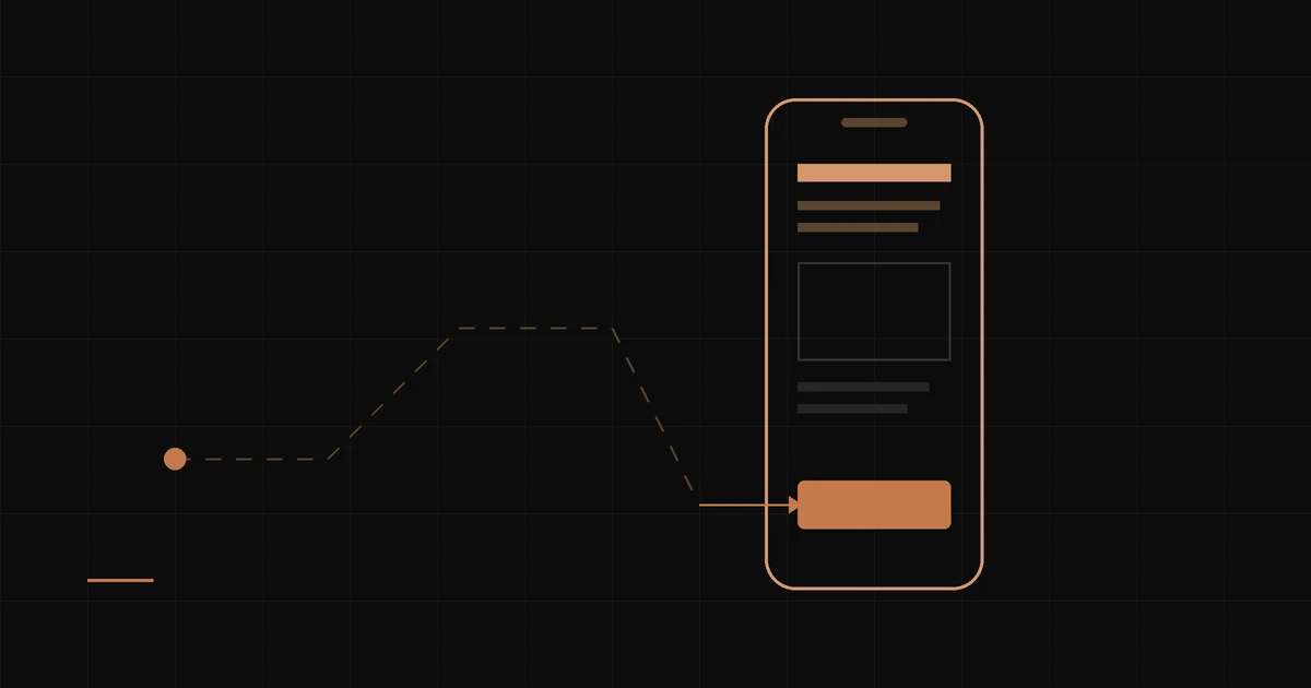
Most small business websites are built for the owner. The homepage opens with a welcome message, the company history sits above the fold, and the phone number is hiding in the footer. It looks fine in the meeting where it gets approved. Then a real customer shows up on a phone in a parking lot, can't find what they need in five seconds, and leaves.
Customer-centric design flips the question. Not “what do we want to say?” but “what did this person come here to do, and how fast can they do it?”
Every visitor arrives with three questions
Whether they found you on Google, in an AI answer, or from a friend's text, almost every first-time visitor is trying to answer the same three things:
- Am I in the right place? Do you do the thing I need, in the area I'm in?
- Can I trust you? Are you real, current, and good at it?
- What do I do next? Call, book, order, get a quote — and how?
A customer-centric site answers all three on the first screen, without scrolling. Everything else on the page is supporting evidence.
Design for the phone first, because they are
For most local businesses, the majority of visitors are on a phone, often in a hurry. That changes the priorities: a tap-to-call number that's always visible, hours and location you can see without hunting, buttons big enough for a thumb, and pages that load before they lose patience. A desktop layout squeezed onto a small screen is not mobile design. It's an afterthought with a smaller font.
Use your customers' words, not yours
Owners describe their business in industry language. Customers search in plain language. A florist might call it “event floral design”; the customer is typing “flowers delivered Friday Overland Park.” A deli calls it “artisan provisions”; the customer wants to know if you're open and whether they can order ahead. Write the headline the customer would have written. It reads better, and it's exactly the language Google and AI assistants match against.
One page, one job
Every page should have a single primary action, and it should be obvious. If a homepage offers “Learn more,” “Our story,” “Follow us,” “Sign up for our newsletter,” and “Contact,” the visitor has five choices and no direction. Pick the action that makes you money — call, book, order, request a quote — and make it the loudest thing on the page. Repeat it after every section that builds a reason to act.
Put proof where the decision happens
Reviews buried on a testimonials page don't do much. A real review sitting right next to the “Book now” button does. Same with photos of your actual work, your actual team, and your actual location. Stock photos of smiling strangers tell a visitor nothing; a photo of the job you finished last week tells them you're real.
What to cut
- “Welcome to our website” headlines. They know where they are.
- Rotating sliders. Nobody waits for slide three.
- Mission statements above the fold. Earn the right to tell your story first.
- Pop-ups that fire before the visitor has read a sentence.
- Anything that only matters to the owner.
How to test your own site in five minutes
Hand your phone to someone who has never seen your site. Ask them to find your hours, figure out whether you serve their area, and get in touch with you. Don't help. Watch where their thumb hesitates. Every pause is a customer you're losing to a competitor whose site answered faster. That's the whole discipline in one exercise — and it's how we review every site we build before it launches.